Sunday, March 31, 2019

Prep and a Crazy Night of Filming

Coming back from my vacation, Jonathan and I used the remainder of our spring break to finish shooting for our film opening. On Friday night, I went over to his house and we set up everything that we would need to shoot and on Saturday night we shot all of the footage.

On that Friday night we no longer had the rolling cart that we used for the bar scene because I had to return it but we did have the step ladder and a couple other items laying around in Jonathan's garage that allowed us to get the right height level for both Jonathan and I. We ended up placing an old toaster oven, an empty crate, and a box of wipes on top of the step ladder which we also used for the bar scene to place the tripod on top of. This can be seen in the picture below.


We also wanted to use fake blood for the scene at the lamp post where Homer beats up Peter so Jonathan went out an purchased the ingredients we needed ahead of time and found a YouTube video that allowed us to make the blog. Below is the video along with a picture of the blood that we ended up creating.


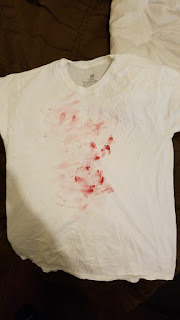
We also spread blood on a white shirt that Jonathan had at his house so that we could have it ready ahead of time for the beat up scene at the lamp post.


On Saturday we then shot our project. The primary location was outside of Jon's house for the outside of the bar scene that we were created. To do this we placed the phone on the stepping ladder shown above and we used my car and darkness to create the scenery.

A few of the shots that I particularly liked were the ones where had Jonathan pressing his body weight down in the trunk of my car to show it bumping down while I was in front of him to indicate the action of me putting a body in my trunk. Along with this shot, I liked the shot I filmed of Jonathan limping past a light into darkness.


While we were filming by the lamp post and the bridge we had a few issues when cars kept passing by obstructing the shot so we had to take some of them multiple times.

Another event that happened was at some point past midnight when we were filming the shot of Jonathan running past the bridge a man drove past us in his truck with a modification on his horn that made it the sound and intensity of a train horn. I was about a foot away from the car and I jumped up and screamed at the top of my lungs.

After this event for the remainder of our shoot, Jonathan and I were both startled by the cars passing by, specifically trucks, and concerned with passing cars seeing a person on the ground near a lamp post in a bloody shirt.

We surprisingly lucked out and sprinted back to my car the second we finished shooting and never looked back.

While there were serious doubts that our lamp post location was not eerie and creepy coming from our classmates and instructor, I can emphatically guarantee you that after I literally got the life scared out of me, that there should be no doubts in anybody's mind.

Saturday, March 30, 2019

Challenging Conventions and Representation

The typical conventions used when dealing with people who have a type of mental illness is done in various ways. From my viewpoint, they can be split into two sections being a normal and impaired representation.

The normal representation is when you have the character who is dealing with an illness and the viewer is basically unaware that there is anything wrong until a later point in the story. This can be seen in Mr. Robot and Fight Club. Both of these pieces have a main character who is telling a story but it doesn't become clear until later that what the audience was watching was entirely warped towards that character's illness and it completely changes the meaning of the entire piece. This only works for longer and more drawn out pieces which is why Jonathan and I did not go for this approach.

On the other hand, there is the impaired representation and this is when you have the character and it is clear what they are doing is wrong or different from a typical action. Along with this the characters around them are affected and it is obvious to the audience that something is wrong with the impaired character. This can be seen in pieces such as BoJack Horseman and Jessica Jones where each respective character deals with depression and PTSD. This is the approach that we took in our opening.

The social group that our opening revolves around are people who suffer from mental illness and it is similar to the conventions that I just spoke about. The way that we chose to represent our mentally ill character is by having them do actions that they wouldn't regularly do but then realize immediately after that he has done something wrong. In order to move our opening and the story of our supposed film along we started it off by clearly illustrating this character who is a little disoriented and then exposing the big event that has lead them to be acting in such a way.

The event where he harms and possibly kills a person he has never seen before due to events that he couldn't even entirely control is the story we are going for. We are going for this impaired representation where the character is more than aware that what happened is wrong but he has already gone through with it. The story that follows after this opening is him calling the police because he regrets his actions but he then leaves immediately after due to his fear in himself for what he could do again.

Sunday, March 24, 2019

The Font is Set!

Due to the fact that spring break is approaching, Jonathan and I need to have everything ready before we shoot towards the end of that week. One of the last decisions we had to make was the font that we are going to use for the credits and the title of for the tilt that we are using. In my previous post on 3/11/19, I discussed the intention behind why we were considering each font and what each of them represented to me.

To refresh your memory the fonts that we were choosing from were Chiller, Gloucester MT, Eras Demi ITC, Maiandra GD, Mistral, Niagara Engraved, and Viner Hand ITC. All of the fonts are displayed below in the respective order.


We decided to go font by font and discuss the possible issues with each font and how well they worked with our representation of the characters and the message of the opening. The first font, Chiller, for starters felt as if it could be too illegible and our goal is also to represent a slightly crooked and deranged mental state for our character and this was too crooked and off-putting to us.

For the second through fourth fonts, Gloucester MT, Eras Demi ITC and Maiandra GD, as I just mentioned we are going for this slightly crooked aspect in our character and title but these fonts all use straight letters and don't provide any sort of cracked elements in them. The spacing feels too perfect and in our eyes just couldn't work.

The fifth font, Mistral, stood out the most as it was clear to see and what we liked the most was the letters not being perfect strokes in the sense that the tip of the 'A' was mvoing a little further and this followed with the other letters.

For the sixth and seventh font, Niagara Engraved and Viner Hand ITC, we ran into the same issues again where Niagara was too straight and perfect with its spacing and Viner was too illegible along with the aspect that the letters were too crooked.


After all of our deliberation we have decided on Mistral as it made the most sense considering all of our problems with the other fonts.

Saturday, March 23, 2019

We Ran into More Problems (Bar Scene)

To our luck, on Wednesday night as I arrived at Jonathan's house it started raining AGAIN. We contemplated shooting in the rain but the fear of damaging my phone as it is recording and obstructing the shot as the water dripped in front of the camera made us realize it wasn't a possibility.

To once again make sure our time wasn't put to waste we constructed a makeshift bar that we could use for one of the three major scenes within our opening. To create this we used a dark blue bed sheet that we hung up in Jon's garage and then had a rolling cart that we placed a white wooden board on top of to make it seem like a bar top. To create the idea that my character, Homer, is actually drinking, we placed a shot glass next to me in the shot along with a vodka bottle to my side. In the glass itself, we used water which made vodka the easiest choice of alcohol for us to fabricate.


The way that we allowed ourselves to get the shots was by using a stepping ladder and placing it in front of our makeshift bar. The angling and framing was also a difficulty that we ran into because we weren't provided with a lot of space so we had to deal a lot with closer shots and Jon and I both had to be on our knees so it would seem that our bodies were the right size with the bar top. 

Since we have spring break coming up we plan to shoot the rest of the project later during that week as I will be out of town for a few days.

Thursday, March 21, 2019

Shooting Schedule Outline

On the Tuesday night mentioned in my previous blog where Jon and I couldnt film due to the rain, we decided to also create a basic shooting schedule overview along with our practice title scroll. The purpose of this concise schedulde was so that on Wednesday shooting would be easier for us to get through.

This is the schedule we created: 

Shooting Scedule Outline

Purchase:

-corn starch
-red food coloring
-blue food coloring

Shots

Inside Bar:

-Bailey drinking Jon comes to say hi
-close up of Jon face (credit)
-pushing off Jon
-bailey leaves

Outside Bar:

-Bailey walking out (approached right third into focus) and Jon in soft focus (left third)
-Jon tries to consult Bailey and touches him
-Bailey decks him in his shit

-dumping body in car (back shot of bailey , car bumps down)
-POV from Jon looking at Bailey in trunk
-POV from Bailey struggling to close trunk looking at you

-car driving shot (iffy)

Lamp Post:

-Jon on ground crawling back from high angle
-beating up scene
-on Jon's body tilt up


Post Title:
-possible reverse zoom shot
-full shot of original zoom out

The first section ismt directly related to shooting but it is for essentisl items that we need to purchase in order to make the fake blood for our project.

The following section showcases our opening broken up into 4 main parts: Inside Bar, Outside Bar, Lamp Post, and Post Title. Every name is self-explanatory and in each are the key parts that are within that section.

The Inside and Outside Bar sections are relaying the story amd shots showcasing where we will use our credits and the specifc angle or position of the camera that we want. Both of these sections carry the story up to the point where the parallel editing is about to come to an end.

The Lamp Post amd Post Title sections have the importamt aspects for the tilt up that we want to use for the title scroll down and the Post Title revolves around the continuation of the next scene to have the feel of the opening stray away from a trailer feeling.

Tuesday, March 19, 2019

Testing Our Title Scroll

On Tuesday night Jonathan and I met up so that we could shoot our project and have some footage to edit with after the fact. We had everything ready with our camera and the shots that we wanted to gather but once we began, it started raining. We tried to wait it out and get some footage but it didn't let up for the entire night.

In order to make sure that we didn't waste all of our time, we wanted to try and create an idea of what our opening title sequence would look like. Our title, Aberration, comes down onto the screen when the camera tilts up from Peter's body in the story. The font, as discussed my post on 3/11/19 shows the red color and one of the crooked/contorted fonts that we liked. In this video we went with the Chiller font just to test it out.


The tilt-up done here was from my car into the night sky because the tilt in our actual video will be up into a dark sky as well. Along with that, I edited this in Adobe Premiere (seen above) and it allowed me to create the drag and opacity change that I used.

The scroll down is done quite simply as you can click on a text box, ours saying "Aberration", that you want to use and then it is now mobile. You can drag the text box anywhere you want from the start of the scene to the end and to create the movement you simply set a primary location and a final location for the text box to move along.

The opacity was also not hard as it is the same concept as the text scroll I had just done. I simply set a primary amount of opacity at a specific time and then a final level at a specifc time as well. My goal was to have the background become darker as the text reaches the end of the screen.

I am well versed in Premiere so doing this didn't take me long and I think that for the base of the editing in the project I will be able to handle it in an efficient manner.

Sunday, March 17, 2019

Group Meeting Numero Dos

A few weeks ago I made a post about a group meeting where I met with other students in my class who are doing different projects for their exam (magazine/film opening). The premise of the meeting that took place this past class was to show the development that everybody has made in their project since the previous meeting. My focus during this meeting was to relay the major transition that Jonathan and I made from moving past the idea of wanting to use the song ‘Breakfast in America’ by Supertramp and explain the new eerie idea we have for the suspenseful demented character in Homer. I explained how we want to have him stand by a lamp post and create two parallel events that will link at the end. I also explained the idea behind our title 'Aberration' and how we landed on our title and the font that corresponds with it.

The major takeaway that I gathered from this meeting is that there is a high chance that we might have to abandon some of the story or shots that we have in mind for the sake of the timing allowed in the two minutes of the opening. This might cause a shortage in our story ark or in our events. Taking this information Jonathan and I have addressed some ideas that we might try to cut but we want to have footage before we make a final decision.

Another major takeaway that I gathered is the amount of time that the editing is going to take. The majority of this is going to come from the sense of parallel scenes that we will be trying to create through the editing, the voiceover matching the movement of Homer's mouth in the zoom out scenes, and the title scroll down being in sync with the tilt up of the camera. To make sure that there is enough time I will be editing as much of the project as I can during spring break which begins next weekend. I have set out multiple time slots with a multitude of hours in each of them where I can edit and if I need consultation I will easily be able to contact Jonathan.

Overall, I now have a clear idea of how much time I am going to need to allocate for each part of my project and what was liked/dislike in my project. From the reception, I gathered people like the title and all the ideas that we have but a heavy dislike or concern was to ensure we are not steering towards a trailer feeling with such a quick paced opening. 

This week Jonathan and I will hopefully finish all of the shooting that we need and then the editing will start immediately after that. I feel as if we are on a good pace and that there is no need to stress or worry about any constraints that we have for the project.